Design Direction: Will Miller
Design + Production: Ruth Lin
Animation: Will Miller, Ruth Lin
Typeface: Marund by 26A1
Winner of The Society for Typographic Arts competition (STA100), 2025.
STA100 Winner in The Society for Typographic Arts competition.
Design + Production: Ruth Lin
Animation: Will Miller, Ruth Lin
Typeface: Marund by 26A1
Winner of The Society for Typographic Arts competition (STA100), 2025.
STA100 Winner in The Society for Typographic Arts competition.
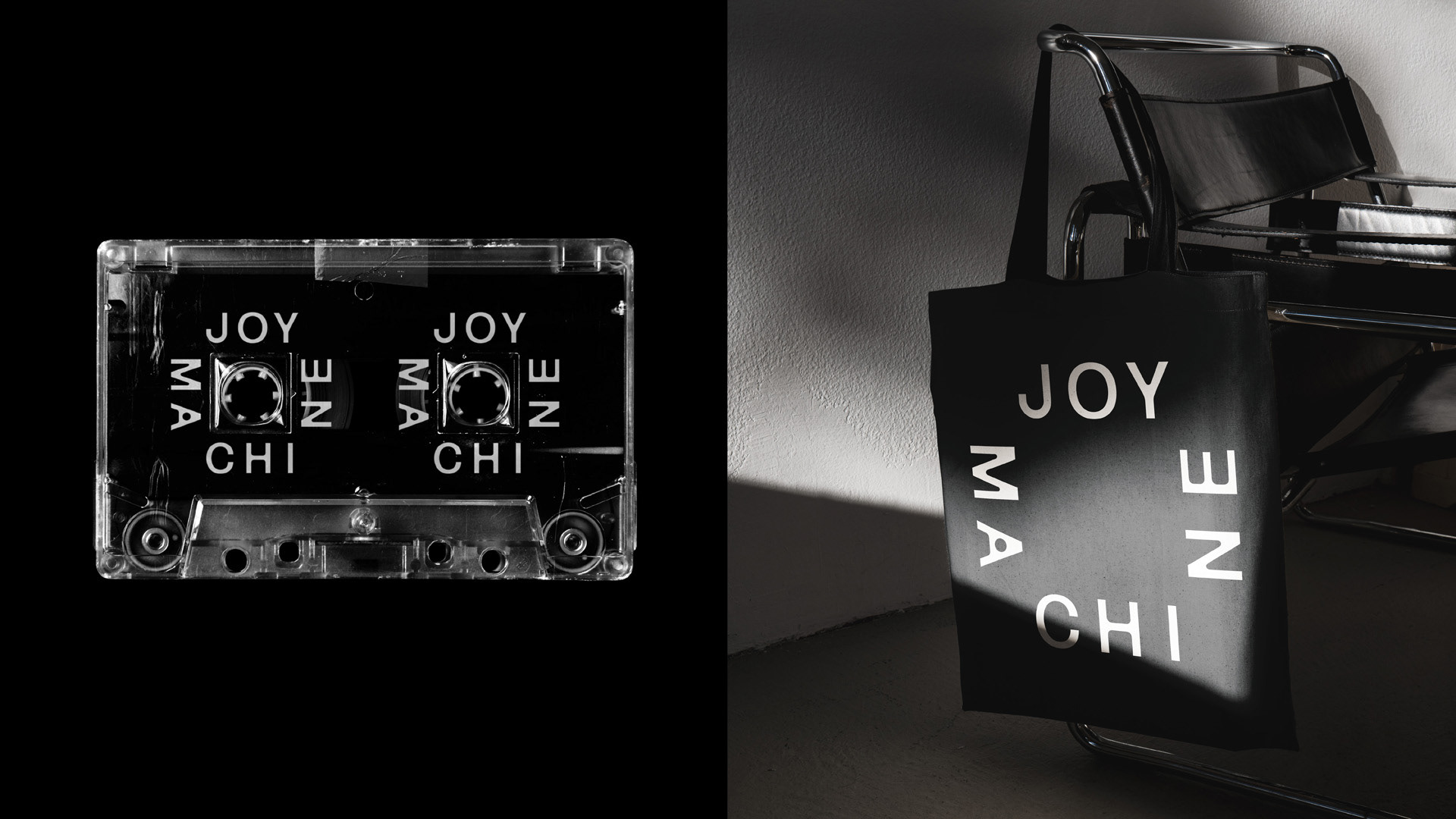
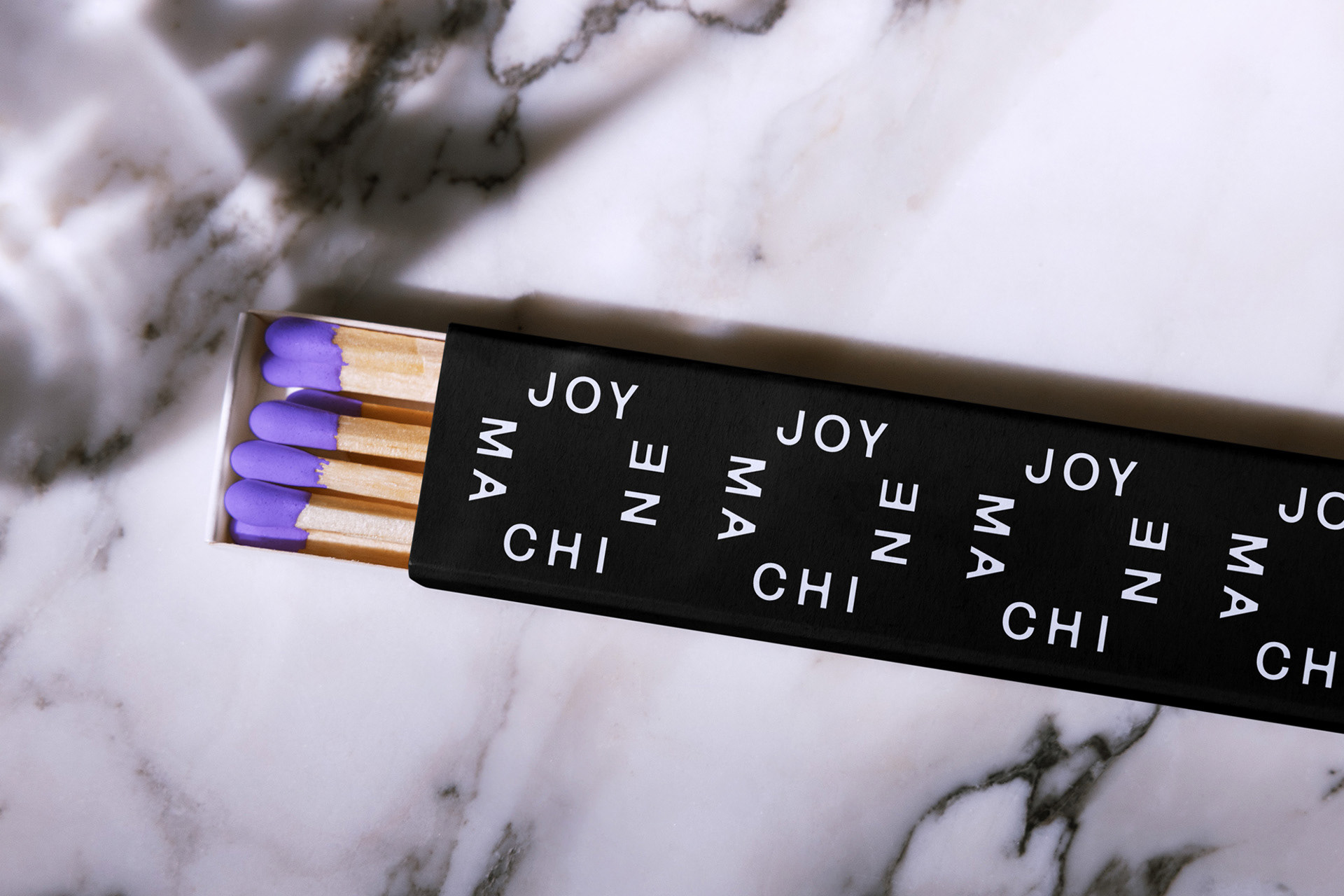
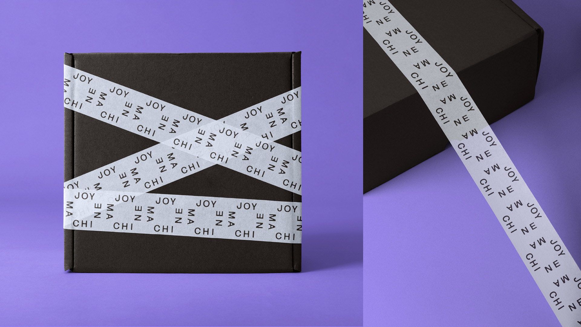
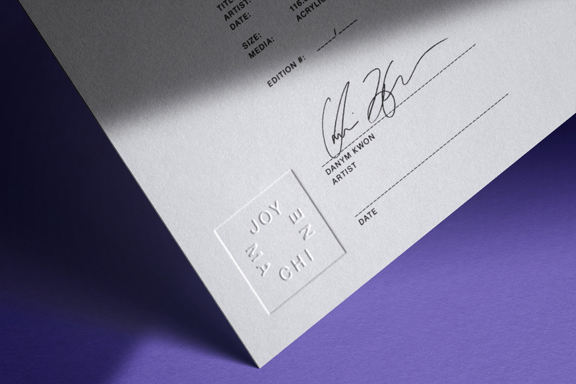
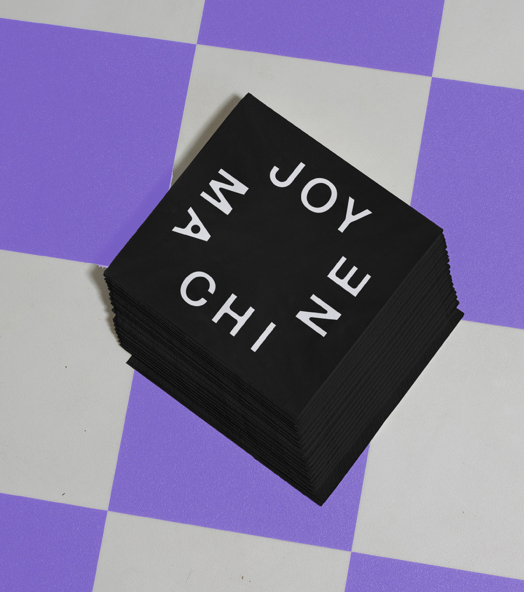
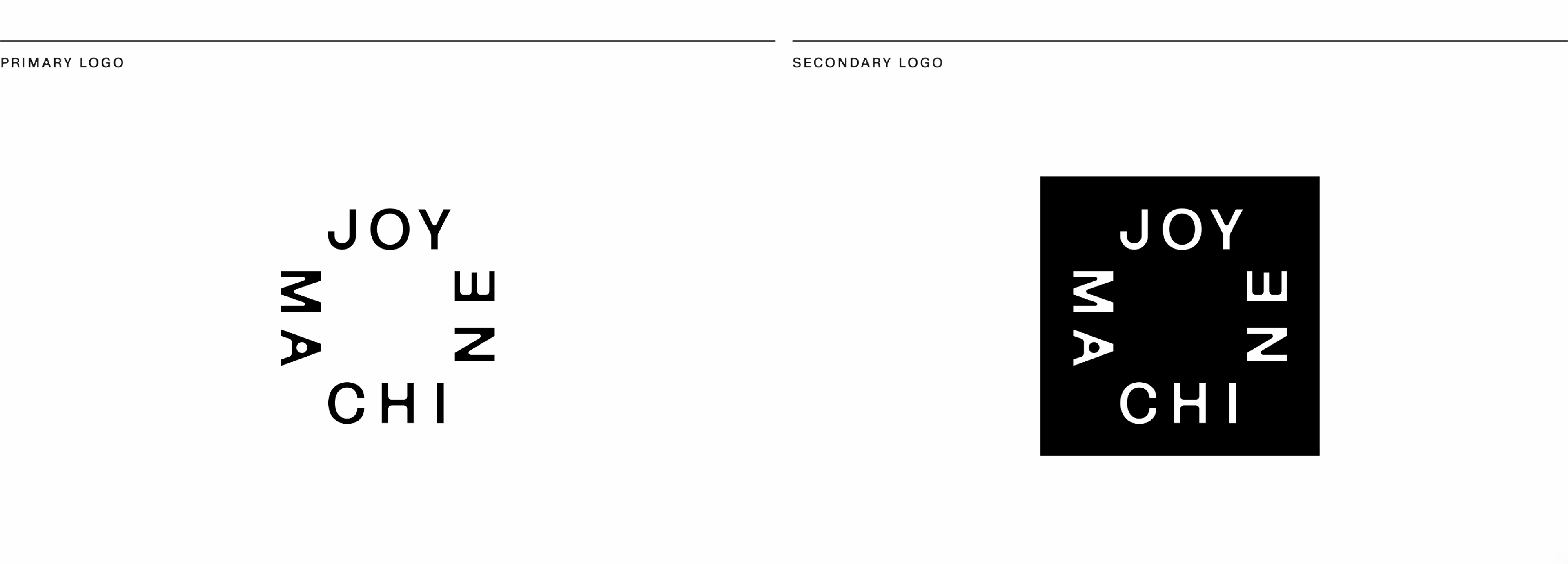
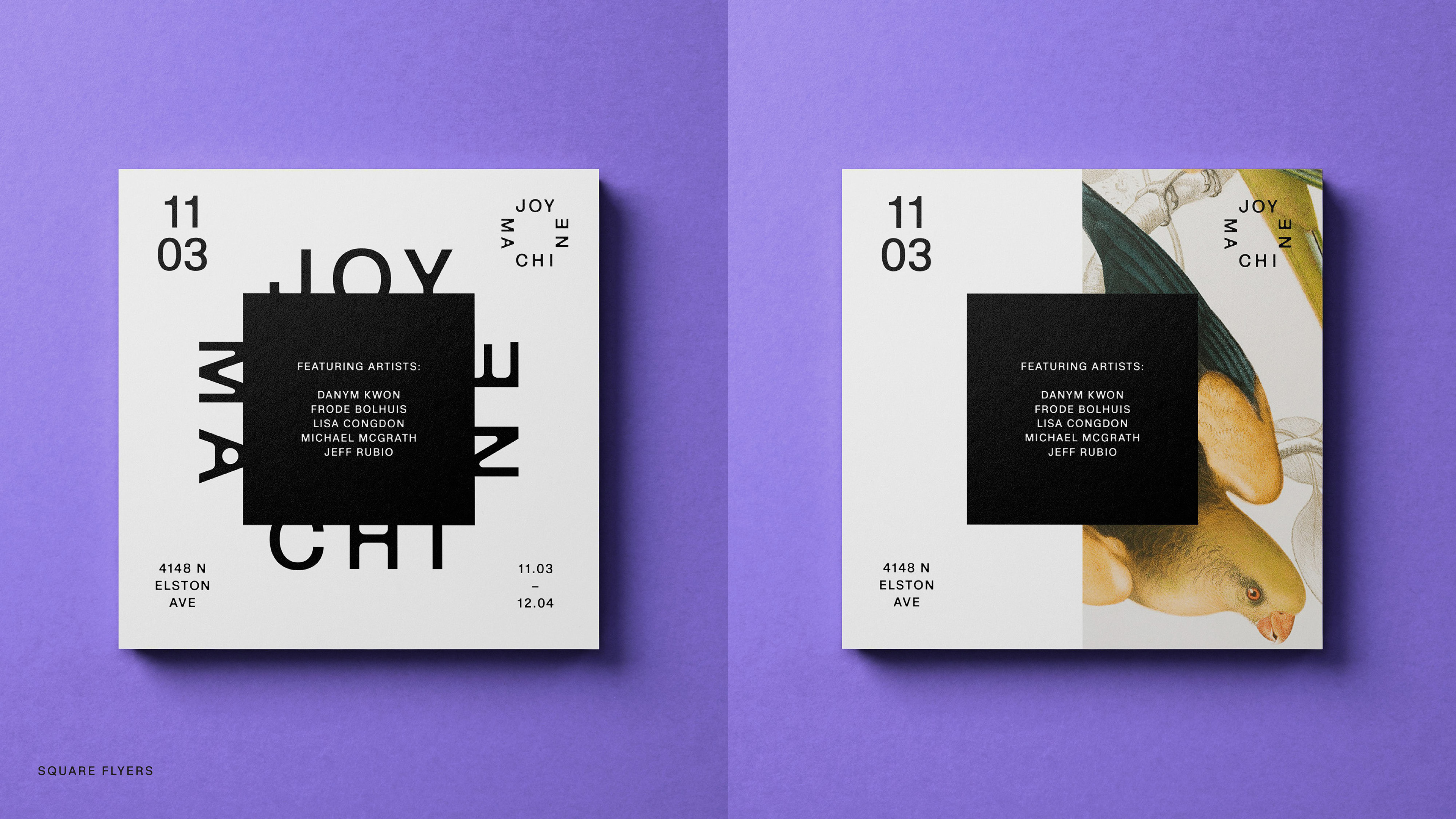
Joy Machine is an open frame that invites viewers to pause and look in. The mechanical type contrasts with its playful rotational arrangement, balancing structural precision with joyful expression. With Joy at the top and Machine oriented like a smile, the logo gives a subtle nod to Chicago through the quick read of JOY and CHl.

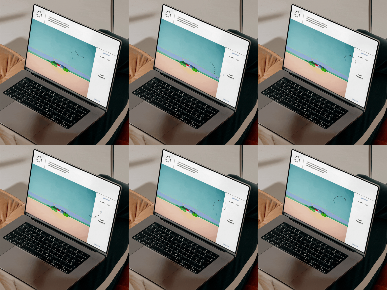
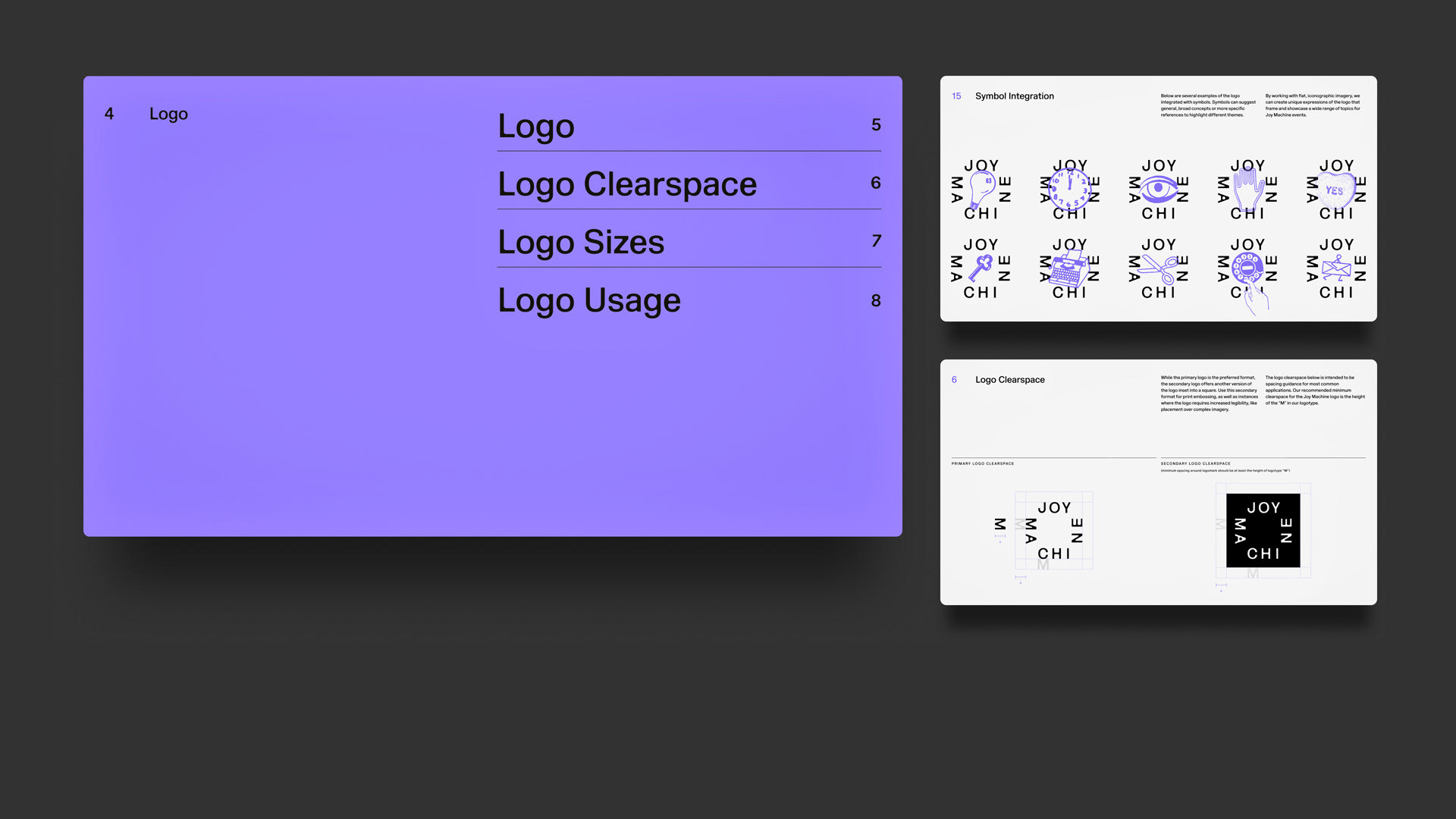
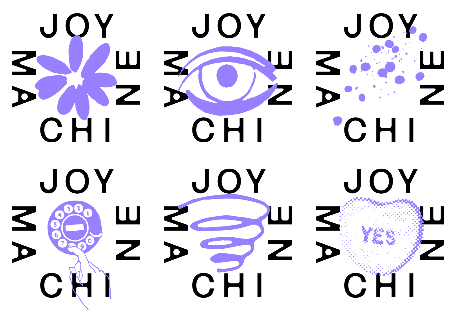
The center of the logo can stay open like a blank canvas or fill in with art, symbols, or moving imagery. These expressions of the logo showcase a wide range of topics for Joy Machine events. Symbols can suggest broad concepts or specific references to highlight different themes.
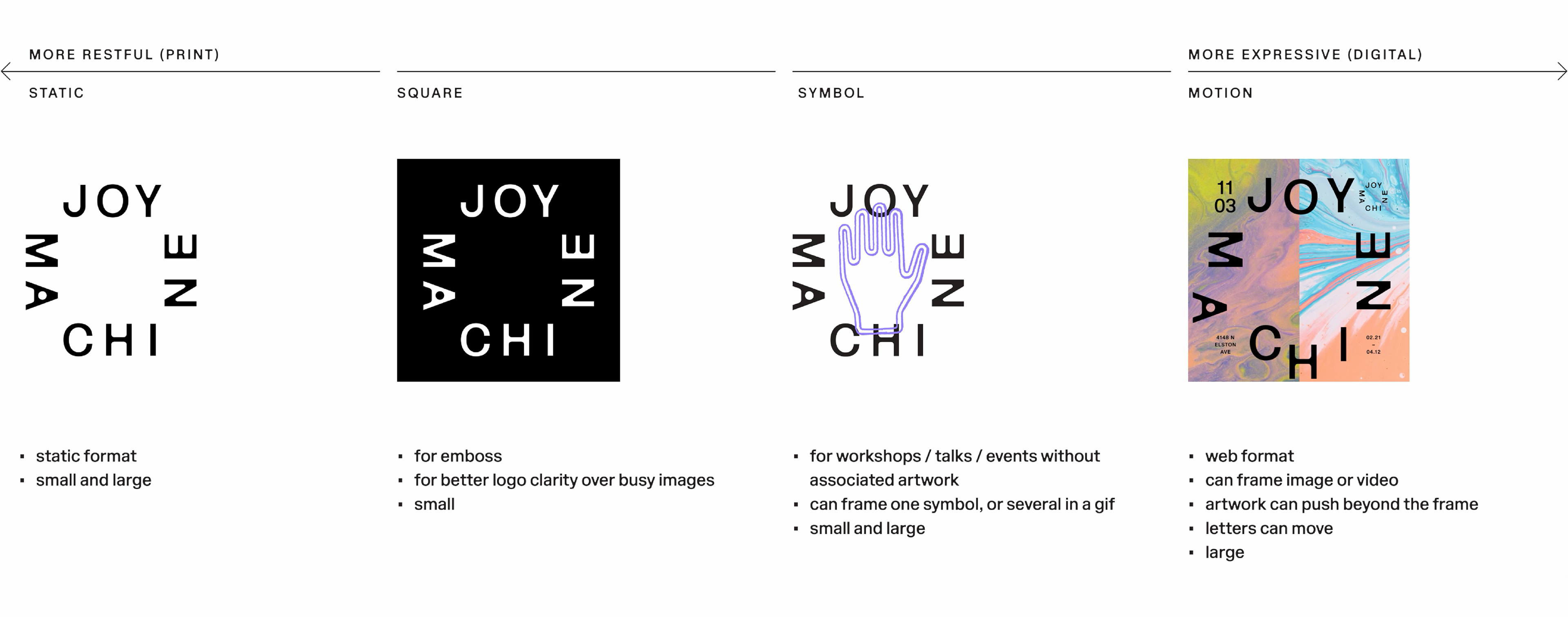
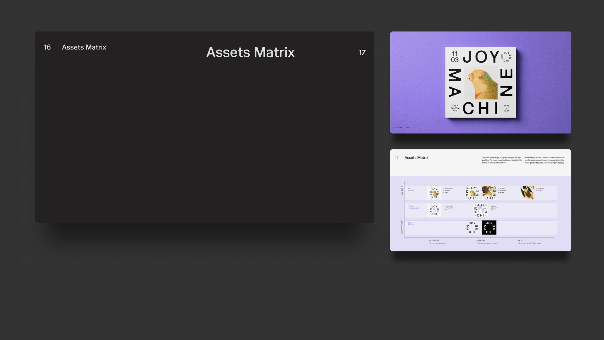
The visual identity can scale on a spectrum from restful to more expressive. Core brand pieces are quieter expressions of the identity, while digital spaces offer more playful and active opportunities for art and motion to come through.
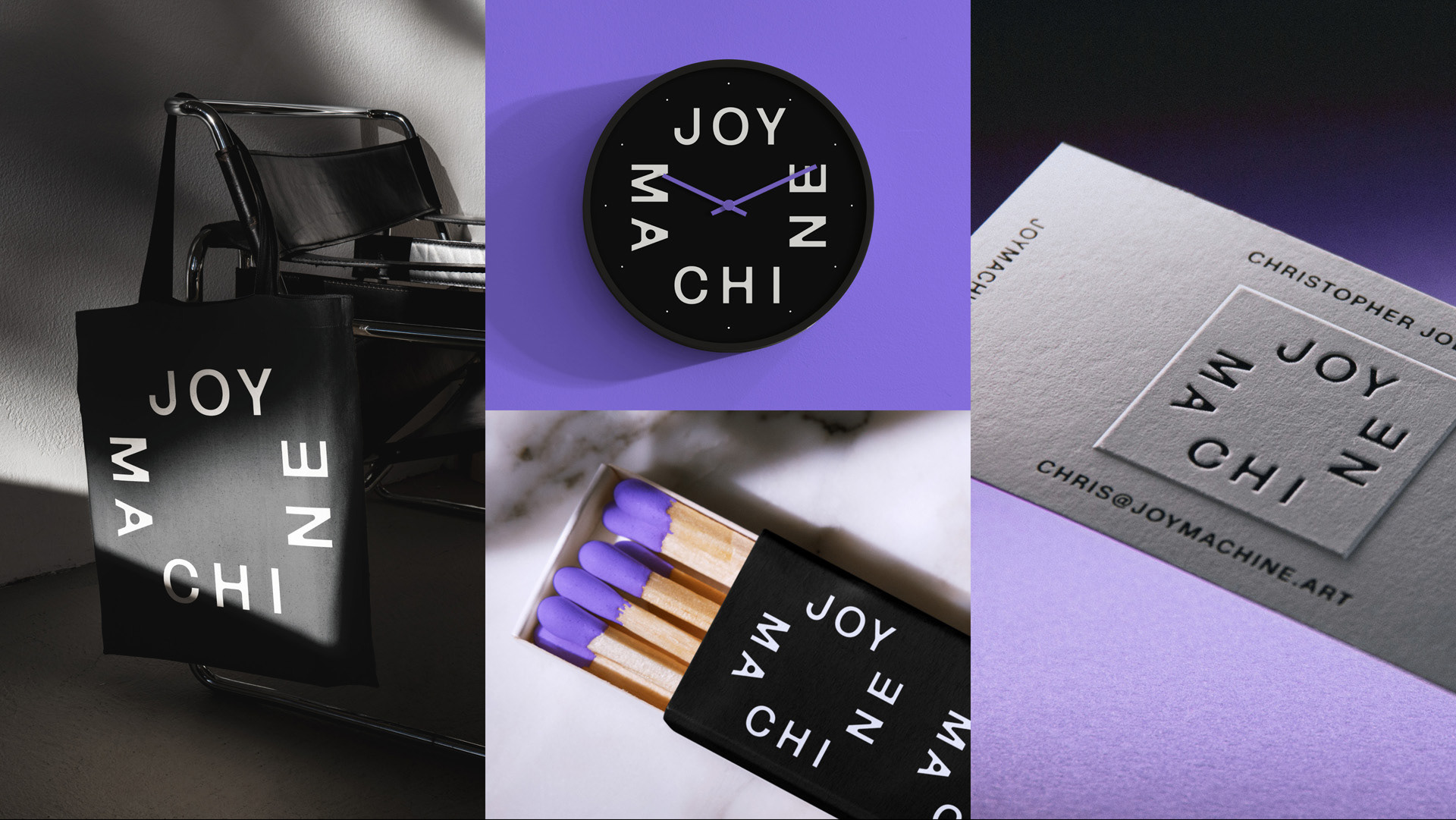
The simple palette uses a distinct purple accent inspired by the color of ink used in a classic joyful machine—the mimeograph.
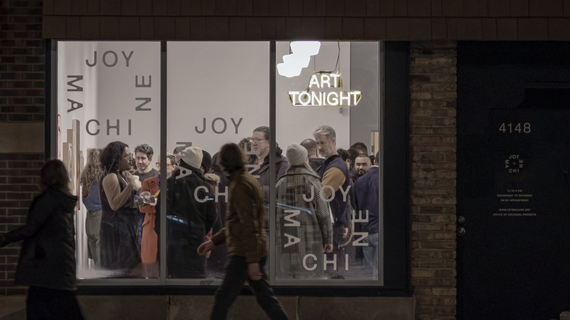


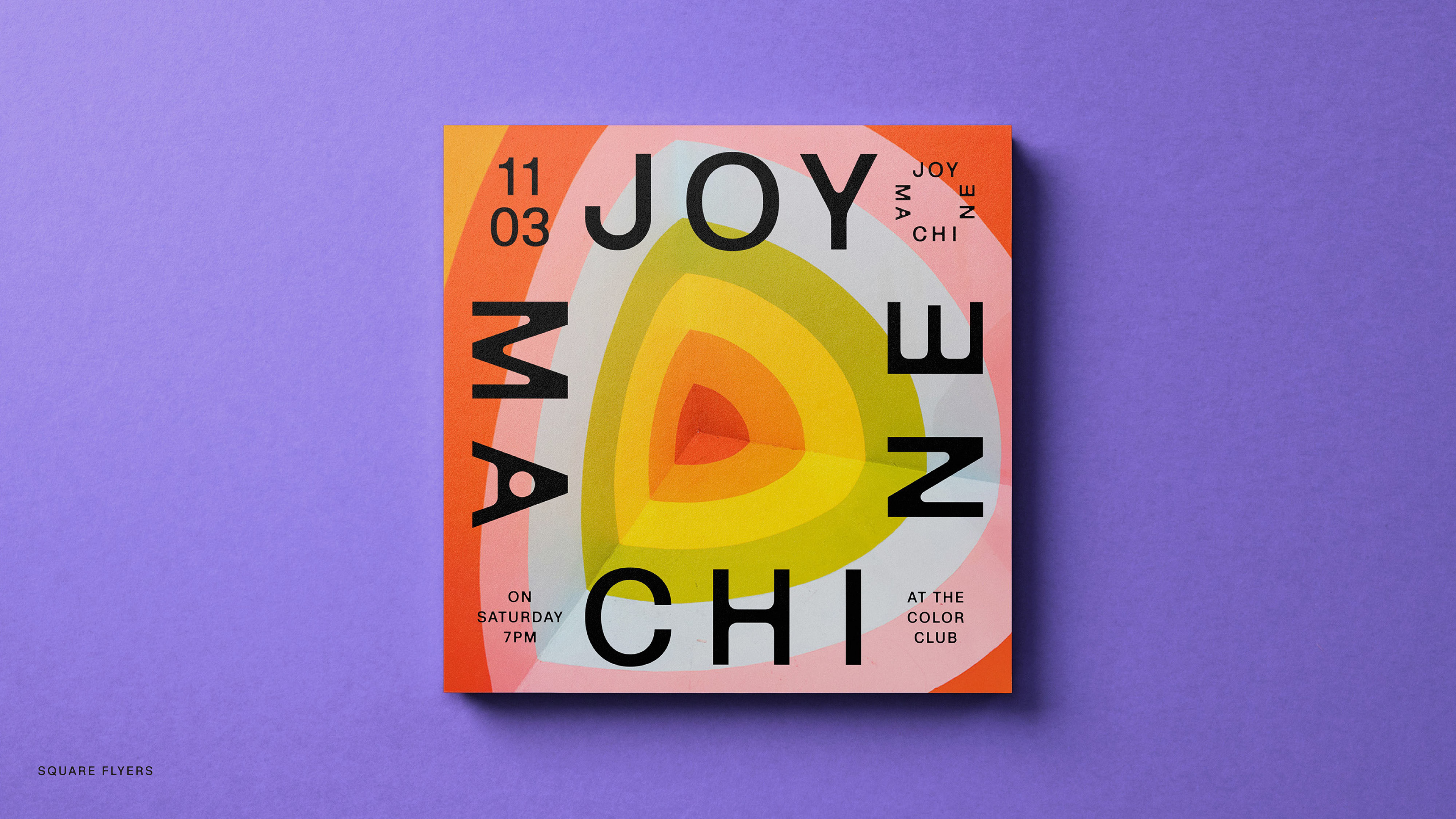



A design approach for campaigns across time, ranging from more art-focused to more gallery-focused content.